29 Apr 2025
Building Components for Markdown in Astro
Why use .mdx when .md will do?
11 min read
MDX allows you to use JSX in Markdown, embedding these components within the content, adding more flexibility in the type of content Markdown can generate.
import {Chart} from './snowfall.js'
export const year = 2023

# Last year’s snowfall

In {year}, the snowfall was above average.
It was followed by a warm spring which caused
flood conditions in many of the nearby rivers.

<Chart color="#fcb32c" year={year} />
However, I use Neovim, and Neovim has a shocking lack of good support for MDX files.
After trying to replicate Hugo’s shortcodes in Markdown and spending a bunch of time trying to get MDX to work nicely with Neovim for @git-mastery, I decided to look into how I could do it purely in Markdown.
Shortcodes in Hugo are custom templates that you could embed in your markdown files:
{{< gist user 23932424365401ffa5e9d9810102a477 >}}Problem
As part of @git-mastery’s setup guide, I wanted to collapse information into tabs, such as having different OS instructions. I wanted users’ preferences to be persisted into localStorage, and shared across all other tabs with the same “key”. However, without MDX, this was not easy to create.
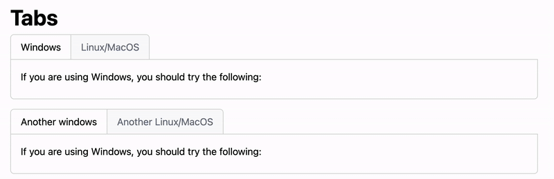
Additionally, the syntax to create these tabs should be as minimal as possible, so that authors of these files do not need to write extra convoluted Markdown.
::::tabs{key="bash_installation"}
:::tab{value="windows" header="Windows"}
If you are using Windows, you should try the following:
:::

:::tab{value="unix" header="Linux/MacOS"}
If you are using Linux or MacOS, you should try the following:
:::
::::

::::tabs{key="bash_installation"}
:::tab{value="windows" header="Another windows"}
If you are using Windows, you should try the following:
:::

:::tab{value="unix" header="Another Linux/MacOS"}
If you are using Linux or MacOS, you should try the following:
:::
::::
Markdown processing
Before diving into the implementation details, let me briefly cover the high-level of how Astro processes Markdown files and generates the resulting HTML pages.
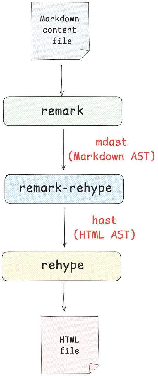
Astro uses remark, remark-rehype, and rehype to process Markdown files, converting them into HTML files that are rendered (like this page!).
remark: processes Markdown files asmdastor Markdown Abstract Syntax Tree (AST)rehype: processes HTML files ashastor HTML ASTremark-rehype: transformsmdastintohast
To build the tabs system, we essentially have to “modify” the final HTML that we generate, so the syntax used above is correctly transformed into the necessary components.
Using directives
To achieve shortcode-like syntax, we can use remark-directive, an extension on top of remark that allows :::container to be parsed as a custom component in remark.
So,
:::tabs
:::
Would be recognized as creating a “container directive” with name tabs which we can identify in the mdast generated.
remark-directive also supports parent-child nesting:
::::tabs
:::tab
<!-- tab is a child component to tabs -->
:::
::::
Directives are declared via :::name[label]{attributes}.
For this use case, we only care about the attributes, which have the following syntax:
{a=b}or{a="b"}: creates an attributeawith value"b"{a="b" c="d"}: creates two attributesaandc{.big .red}: creates theclassattribute where the class is"big red"{#big}: creates theidattribute where the id is"big"
We use these attributes to provide the following properties for our tabs:
tabs{key=""}: globalkeyoftabstab{value=""}:valueassociated with the parenttabs’skey; persisted intolocalStoragetab{header=""}:headerto render at the top of the tabs
Setting up remark-directive
To setup remark-directive in Astro, download the package:
yarn add remark-directiveThen, update astro.config.mjs to include it:
import remarkDirective from "remark-directive";

export default defineConfig({
  vite: {
    //...
  },
  markdown: {
    remarkPlugins: [
      remarkDirective,
    ],
  },
  // ...
});
Now, Astro knows to run this remarkDirective remark plugin.
Plugins
Notice that remark and rehype aren’t just single one-off extensions, but rather, a suite of plugins that incrementally and sequentially modify the mdast and hast respectively:
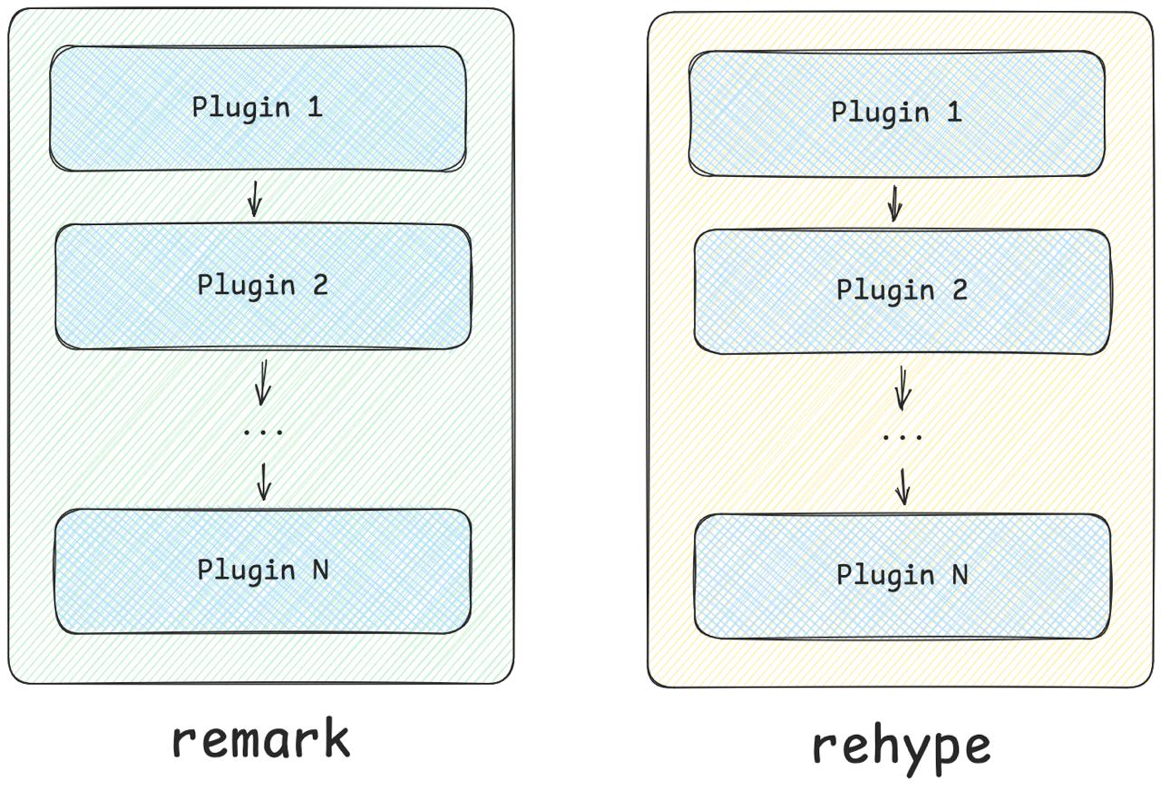
As such, we can build our own plugins to implement custom transformations on top of the original mdast and hast.
Creating a remark plugin
Now that we have access to directives, we can build a custom plugin that will transform the tabs directives into the necessary elements.
remark plugin skeleton
First, install the necessary dependency to write a plugin:
yarn add mdast unified unist-util-visitThen, create a new plugin src/plugins/remark-tabs.ts:
import type { Root } from "mdast";
import type { Plugin } from "unified";
import { visit } from "unist-util-visit";

const remarkTabs: Plugin<[], Root> = () => {
  return (tree) => {
    visit(tree, (node: any, index: number, parent: any) => {
    });
  };
};

export default remarkTabs;
A remark plugin, denoted by the type Plugin<[], Root>, is a function that visits the mdast, modifying the node or the node’s parent during traversal (using the visitor pattern).
Our plugin’s mdast transformation will be written within the visit function callback.
Detecting directives
There are several types of directives, but we are only interested in the containerDirective.
if (node.type === "containerDirective"
  && node.name === "tabs") {
  const tabs = node.children.filter(
    (child: { type: string; name: string }) =>
      child.type === "containerDirective"
        && child.name === "tab",
  );
  // ...
}
The plugin only executes the transformation when the current node is a container directive and when the node’s name is tabs.
Creating wrapper elements
Normally, directives are not used in remark, so they will not be converted to a meaningful HTML element. But, we can change that by modifying the hName of a node:
node.data = {
  hName: "div",
  hProperties: {
    className: "tabs"
  }
}
We can even modify the hProperties to include a className for the div.
But, what we want is not just a container for tabs. We want a header for the tabs and a container for the content of each tab.
So instead, we need to generate a wrapper element, which “replaces” the current mdast of the tabs container directive with a new AST element that contains all of the necessary components:
const wrapper = {
  type: "element",
  data: {
    hName: "div",
    hProperties: {
      className: "tabs",
      "data-tabs-key": node.attributes?.["key"] ?? "",
    },
  },
  children: [
    {
      type: "element",
      data: {
        hName: "div",
        hProperties: {
          className: "selector",
        },
      },
      children: tabs.map((tab) => ({
        type: "element",
        data: {
          hName: "div",
          hProperties: {
            "data-tab-selector-value": tab.attributes.value,
          },
        },
        children: [
          {
            type: "text",
            value: tab.attributes.header,
          },
        ],
      })),
    },
    ...tabs.map((tab) => {
      tab.data = {
        hProperties = {
          "data-tab-value": tab.attributes.value
        }
      }
    }),
  ],
};
The specifics of mdast syntax can be found in the Github repository.
There is a ton going on, but essentially, we are converting the initially naive tabs container directive into one with the header, selectors, and tab content.
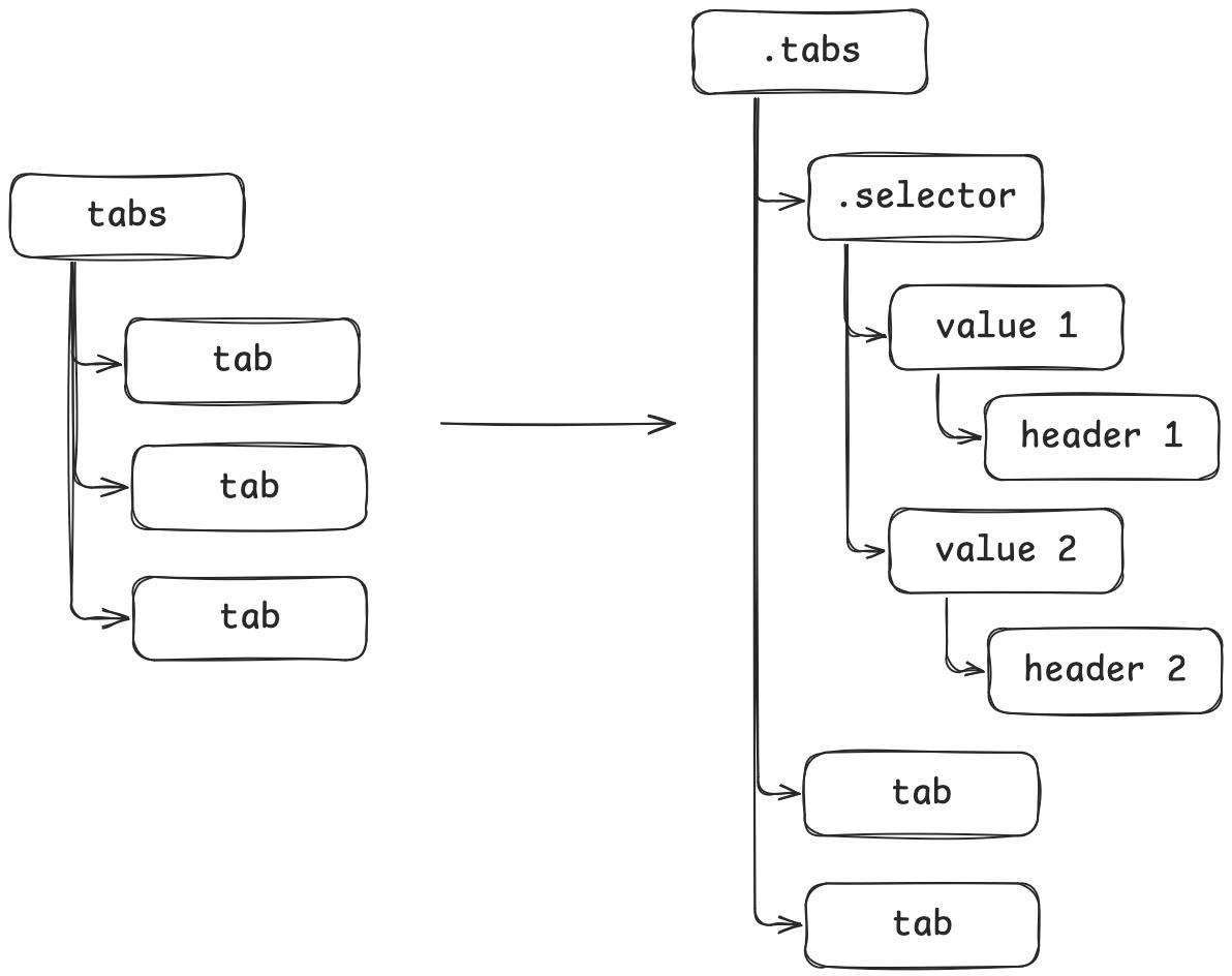
Along with these transformations, we are attaching additional properties (through hProperties) to each component, such as data-tabs-key to be the key attribute of the tabs container directive.
The final step is to set the current node’s parent to this new wrapper element, effectively replacing the current node with this new wrapper:
parent.children[index] = wrapperUsing the plugin
To use the plugin we just created, update astro.config.mjs again, adding the remarkTabs plugin AFTER the remarkDirective plugin.
Recall that plugins run sequentially, so if we used
remarkTabsbeforeremarkDirective, we would not have access to thecontainerDirective.
import remarkTabs from './src/plugins/remark-tabs';

export default defineConfig({
  markdown: {
    remarkPlugins: [
      remarkDirective,
      remarkTabs,
    ]
  }
})
Then, you can verify that the modified mdast changes are reflected by rendering a tabs component and verifying the HTML:
<div class="tabs" data-tabs-key="bash_installation">
  <div class="selector">
    <div data-tab-selector-value="windows">Windows</div>
    <div data-tab-selector-value="unix">Linux/MacOS</div>
  </div>
  <div data-tab-value="windows">
    <p>If you are using Windows, you should try the following:</p>
  </div>
  <div data-tab-value="unix">
    <p>If you are using Linux or MacOS, you should try the following:</p>
  </div>
</div>
Great! But we are missing the critical interactivity of selecting tabs and persisting the choices.
Creating a rehype plugin
Not everything can be embedded within the remark plugin. So, we have to modify the hast generated as well, adding the necessary interactivity for the tabs.
rehype plugin skeleton
Just like the remark plugin, rehype plugins are defined as functions with the visitor pattern.
First, install the necessary dependency (the others were already installed previously):
yarn add hastThen, create the plugin src/plugins/rehype-tabs.ts:
import { visit } from "unist-util-visit";
import type { Plugin } from "unified";
import type { Root } from "hast";

const rehypeTabs: Plugin<[], Root> = () => {
  return (tree) => {
    visit(tree, (node: any) => {
    });
  };
};

export default rehypeTabs;
This time, we are visiting the hast, so we can think of each node as a HTML element.
Detecting elements
Again, like the remark plugin, we will need to detect when we are visiting the various tabs elements created earlier.
if (node.type === "element" && node.tagName === "div") {
  const classNames = node.properties?.className?.split(" ") ?? [];
  if (classNames.includes("tabs")) {
    // ...
  } else if ("data-tab-selector-value" in node.properties) {
    // ...
  }
}
Each node has a type and tagName which we use as the preliminary filters. Then, we can check if the class HTML attribute contains tabs to know that we are visiting the tabs container, or if the node’s properties contains the data-tab-selector-value property, which we added to the selectors.
Storing tab keys on load
When we first load the tabs element, we want to ensure that our localStorage contains the global key.
To do so, we can append a <script> element to the end of the hast:
const tabsKey = node.properties["data-tabs-key"];
const availableKeys = JSON.parse(node.properties["data-tabs"]);
const firstKey = availableKeys[0];
const localStorageTabsKey = `tabs-${tabsKey}`;
tree.children.push({
  // @ts-ignore
  type: "element",
  tagName: "script",
  properties: {},
  children: [
    {
      type: "text",
      value: `
      (() => {
        if (localStorage.getItem("${localStorageTabsKey}") == null) {
          localStorage.setItem("${localStorageTabsKey}", ${JSON.stringify(firstKey)})
        }
      })()
      `,
    },
  ],
});
The specifics of hast syntax can be found in the Github repository.
This is the key to embedding interactivity in Markdown components. It’s not very fancy, but it certainly gets the job done.
The script above will execute when the page loads and store the key tabs-X into localStorage. The key is specified by the author of the Markdown file.
Loading and updating selection
Then, we need to incorporate the user’s selection of tabs, ensuring that their selection:
- Propagates to all other tabs that share the same
tabskey - Updates the
localStoragevalue associated withtabs-X - Switches the visible tab to their selection
const tabValue = node.properties["data-tab-selector-value"];
const tabsKey = node.properties["data-tabs-key"];
const localStorageTabsKey = `tabs-${tabsKey}`;
tree.children.push({
  // @ts-ignore
  type: "element",
  tagName: "script",
  properties: {},
  children: [
    {
      type: "text",
      value: `
      (() => {
          const selectorTabsAcross = document.querySelectorAll("div.tabs[data-tabs-key='${tabsKey}'] > div.selector > div[data-tab-selector-value='${tabValue}']");
          const tabs = document.querySelectorAll("div.tabs[data-tabs-key='${tabsKey}'] > div.tabs-content > div.tab");
          const selectorTabs = document.querySelectorAll("div.tabs[data-tabs-key='${tabsKey}'] > div.selector > div[data-tab-selector-value]");

          const value = localStorage.getItem("${localStorageTabsKey}")
          select(value)

          function select(value) {
              for (const tab of tabs) {
                  if (tab.attributes["data-tab-value"].nodeValue !== value) {
                      tab.classList.remove("active")
                  } else {
                      tab.classList.add("active")
                  }
              }

              for (const selectorTab of selectorTabs) {
                  if (selectorTab.attributes["data-tab-selector-value"].nodeValue !== value) {
                      selectorTab.classList.remove("active-selector")
                  } else {
                      selectorTab.classList.add("active-selector")
                  }
              }
          }

          for (const t of selectorTabsAcross) {
              t.addEventListener("click", function() {
                  select("${tabValue}")
                  localStorage.setItem("${localStorageTabsKey}", ${JSON.stringify(tabValue)})
              })
          }
      })()
      `,
    },
  ],
});
Essentially, we are selecting the necessary elements, loading the initial state, and specifying the click event listeners. When a user selects a tab, it will add the active class to the tab element and the active-selector class to the selector tab, along with updating the localStorage.
Loading the plugin
Like the remark plugin, we need to update astro.config.mjs to use it by adding the rehypeTabs plugin.
import remarkTabs from './src/plugins/remark-tabs';
import rehypeTabs from './src/plugins/rehype-tabs';
export default defineConfig({
markdown: {
remarkPlugins: [
remarkDirective,
remarkTabs,
],
rehypePlugins: [
rehypeTabs
]
}
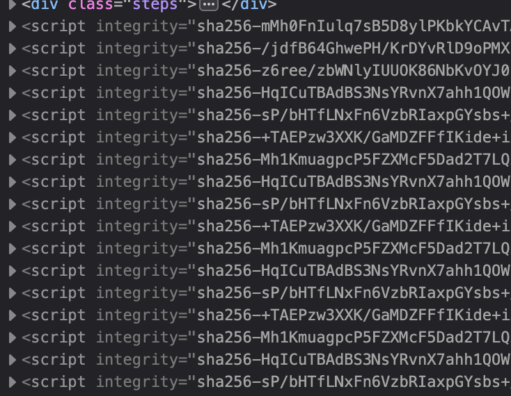
})Then, you can verify that scripts were added to the end of the hast of the parent container:
Styling the component
We are almost done with creating our component. We just need to make sure that the component is styled correctly. The most important part is ensuring that only the active tab is shown.
div.tabs {
  @apply mb-4;
}

div.tabs .selector {
  @apply flex flex-row;
}

div.tabs .selector div[data-tab-selector-key] {
  @apply inline-block px-4 py-2 border-1 border-neutral-300 border-b-0 hover:cursor-pointer;
}

div.tabs .selector div[data-tab-selector-key]:first-child {
  @apply rounded-tl-md;
}

div.tabs .selector div[data-tab-selector-key]:last-child {
  @apply rounded-tr-md;
}

div.tabs .selector div[data-tab-selector-key]:not(:first-child) {
  @apply border-l-0;
}

div.tabs .tabs-content {
  @apply w-full p-4 border-1 border-neutral-300 rounded-b-md;
}

div.tabs div.selector div[data-tab-selector-key]:not(.active-selector) {
  @apply bg-neutral-50 text-gray-500;
}

div.tabs div.tab:not(.active) {
  @apply hidden;
}

div.tabs div.tab.active {
  @apply block;
}
I use Tailwind to style the tabs, but you can use whatever you want. Make sure you import this style into whichever component renders your Markdown files.
Voila! You now have a fully functioning tab system with persistent storage!
Closing
Yes, I built this out of spite due to the lack of good MDX support in Neovim. Yes, it might not be the most intuitive thing. Yes, MDX could have done this with much less effort.
But this was a fun dive into Markdown and HTML ASTs with remark and rehype.
If you are interested, I have written other Markdown components for @git-mastery here.
Enjoyed reading?
Consider subscribing to my RSS feed or reaching out to me through email!